
Explain a chart aloud without losing its denominator
Two correct percentages can mislead when the listener cannot see their column headings.
A chart can be accurate and still be hard to hear. Before turning it into a briefing, say what the whole is, what each category counts, and which denominator the percentages use. Then describe the bars or slices. Without that order, a listener may hear two correct numbers as if they belonged to the same total.
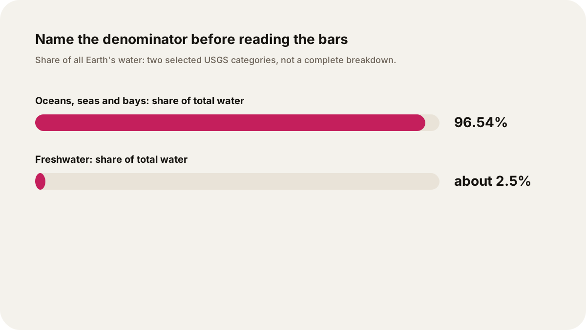
The example here uses the U.S. Geological Survey's global water distribution table. It is a worked reading exercise, not a water-use recommendation or a forecast.
Read the frame before the number
Start with four questions:
- What does the chart measure?
- What is the whole or denominator?
- What does each category include?
- Are the categories a complete set, or did the chart select a few items?
The USGS page says oceans hold about 96.5 percent of all Earth's water. The same page says freshwater makes up about 2.5 percent of all water. Those percentages use the total water supply as their denominator. The page also gives a separate freshwater column for some rows, such as glaciers and fresh groundwater. That is a different denominator.
An audio script should make the change audible: “Now I am switching from all Earth's water to freshwater as the whole.” A listener cannot see the column heading, so the spoken sentence has to carry it.
The USGS example has more than one denominator
The USGS table reports oceans, seas, and bays as 96.54 percent of total water. Its surrounding explanation puts freshwater at approximately 2.5 percent of total water. These two figures share a denominator, but the selected bars leave other water categories out.
The table also says that ice caps, glaciers, and permanent snow account for 68.7 percent of freshwater and 1.74 percent of total water. Fresh groundwater is 30.1 percent of freshwater and 0.76 percent of total water. The same physical store can therefore have two percentages, because the question changed from “all water” to “freshwater.”
Do not put 68.7, 1.74, and 96.54 in one list without saying which denominator each uses. That would make the chart sound contradictory when the columns are answering different questions.
A careful bar description
Illustrative spoken description: “This simplified view selects two categories from the USGS table. Using all Earth's water as the denominator, oceans, seas, and bays account for 96.54 percent. Freshwater accounts for about 2.5 percent. These are selected categories for orientation, not a complete bar chart, so the two bars do not need to add to 100 percent. The freshwater number is the share of all Earth's water. If we switch to the freshwater denominator, glaciers and permanent snow account for 68.7 percent of freshwater.”
Freshwater is an aggregate, not one storage location. The USGS table divides it among ice, groundwater, soil moisture, lakes, atmosphere, swamps, rivers and biological water. Link that full table when a listener needs the breakdown.
If you need a complete chart, choose one denominator and use every category that belongs to that column. If you need a quick comparison, select two categories and label the graphic as selected data. A cropped chart should never imply that the selected bars exhaust the whole distribution.
Make the listening script testable
Before recording, write a source ledger:
| Spoken claim | Denominator | Source check |
|---|---|---|
| Oceans, seas, and bays are 96.54% | Total water | USGS table, percent of total water |
| Freshwater is about 2.5% | Total water | USGS explanatory text and freshwater chart description |
| Glaciers and permanent snow are 68.7% | Freshwater | USGS table, percent of freshwater |
| Fresh groundwater is 30.1% | Freshwater | USGS table, percent of freshwater |
The ledger is for the writer and editor. The episode can link the source and say the denominator in each sentence. It does not need to recite the table's entire bibliography.
An illustrative request for a personal audio show could be: “Explain this USGS water chart for a general listener. Define the whole, state the denominator before every percentage, distinguish selected categories from a complete breakdown, and use one worked comparison between total-water and freshwater columns. Do not make a recommendation about water safety, health, spending, or policy. Link the source and mark any rounded figures.” Keep the explanation tied to the chart and its denominator labels.
The same method works for a budget chart, a survey, or a sports table. The subject changes, but the checks stay concrete: identify the whole, define categories, preserve the axis and units, and stop the inference where the source stops. If the chart does not establish a cause, an audio briefing should not add one.
For more source-to-audio practice, see listening versus reading a long article, how to verify an AI-generated news summary, and public lecture listening syllabus.
Sources
- U.S. Geological Survey, How Much Water is There on Earth?: global water table, total-water and freshwater columns, rounded percentages, and category definitions.
- U.S. Geological Survey, Freshwater (Lakes and Rivers) and the Water Cycle: visual explanation of the 2.5 percent freshwater share and its denominator.
- U.S. Geological Survey, Oceans and Seas and the Water Cycle: 96.5 percent ocean share and total-water context.